

What the Blue/Black/White/Gold Dress Tells Us About How We View Color
Why We Perceive Color Differently
Unless you’ve been stuck at sea for the past two weeks, then you’ve definitely seen the dress that went viral on the internet last week and felt some form of anger at others who think that the dress is the wrong color.
But what color is the dress really? And why do so many of us see something else? The answers may surprise you.
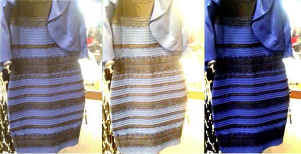
The dress is actually blue and black ? !
- If you think that the dress appears to be bathed in bright sunlight, our eyes often adjust to see the image as darker so you are likely to see the dress as black and blue.
- If you see the dress in shadow, or if you think that the dress appears to be just out of the sunlight, your eyes will often pick up brighter colors. Eyes will often compensate for shadow to pick out brighter colors. Therefore, many people saw this dress as white and gold, disregarding that the dress could be blue.
The dress is actually blue and black. Hate to be the one to break it to you. However many of us can’t see that in the photo because our brains process light differently.
This is why some of us see the dress as white and gold and others see it as blue and black. Each of our eyes are able to assign fixed colors to objects under different lighting conditions.
We call this “color constancy.” What our eyes and brains have trouble processing in this photo is the ambient light surrounding the dress.
This sends different signals depending on how we see where the source of light is coming from, how bright bright we perceive the image and how the shadows affect the image. Each of these factors sends signals to our brains telling us what colors we see in the photo of the dress.
Other photos will show us that the dress is clearly black and blue, however, let’s break down why we see this dress the way we do.
Our eyes often need context cues to pick up on color scheme
Our eyes often need context cues to pick up on color schemes that allow them to see colors more accurately. If this image had featured, say a person, or another dress (as in other photos of the dress), our eyes might pick up on these colors more accurately.
Other objects in an image or even in our line of sight help us perceive things the way they are because our brains pick up on contrasting colors much easier than similar colors.
However, when that ability to use context disappears, we have more trouble picking up colors.
For Example:
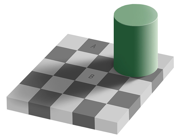
In this image above, we see that it appears that squares A and B are different shades of grey. However….
When we connect the two figures with matching lines, we see that both squares are actually the same color, it is only our brains processing the colors looking for context clues that tells us differently.
The incredible thing to take away from this dress controversy is that it is our minds that make up color instead of being attributed as being permanent properties of an object.
More Resources
You may also like...
-

Top 20 Celebrity Artists That Paint
In researching for our previous post on celebrity art investors, we came across an amazing array... -

Art Changes Everything “Create Art, Change Everything”
You Accepted Our Challenge And We Proved Art Can Change Everything! “Create Art, Change Everything” by... -

More of the Best of Sidewalk 3D Art
Don’t Fall In….Wait, Actually, You Can’t. More of really amazing 3rd Street art with chalk where...